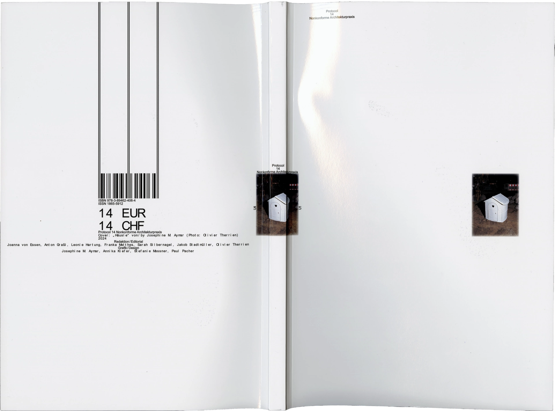
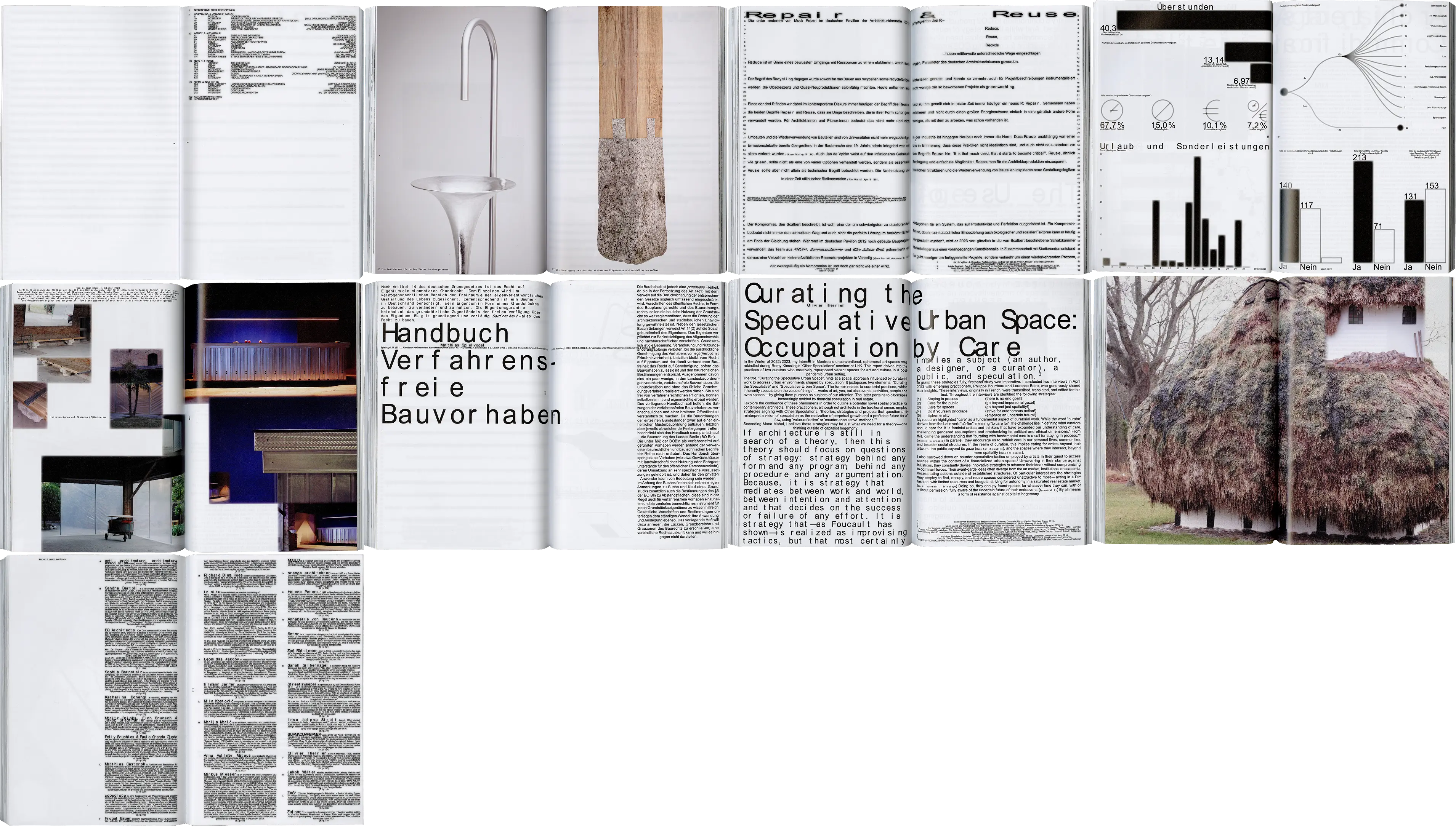
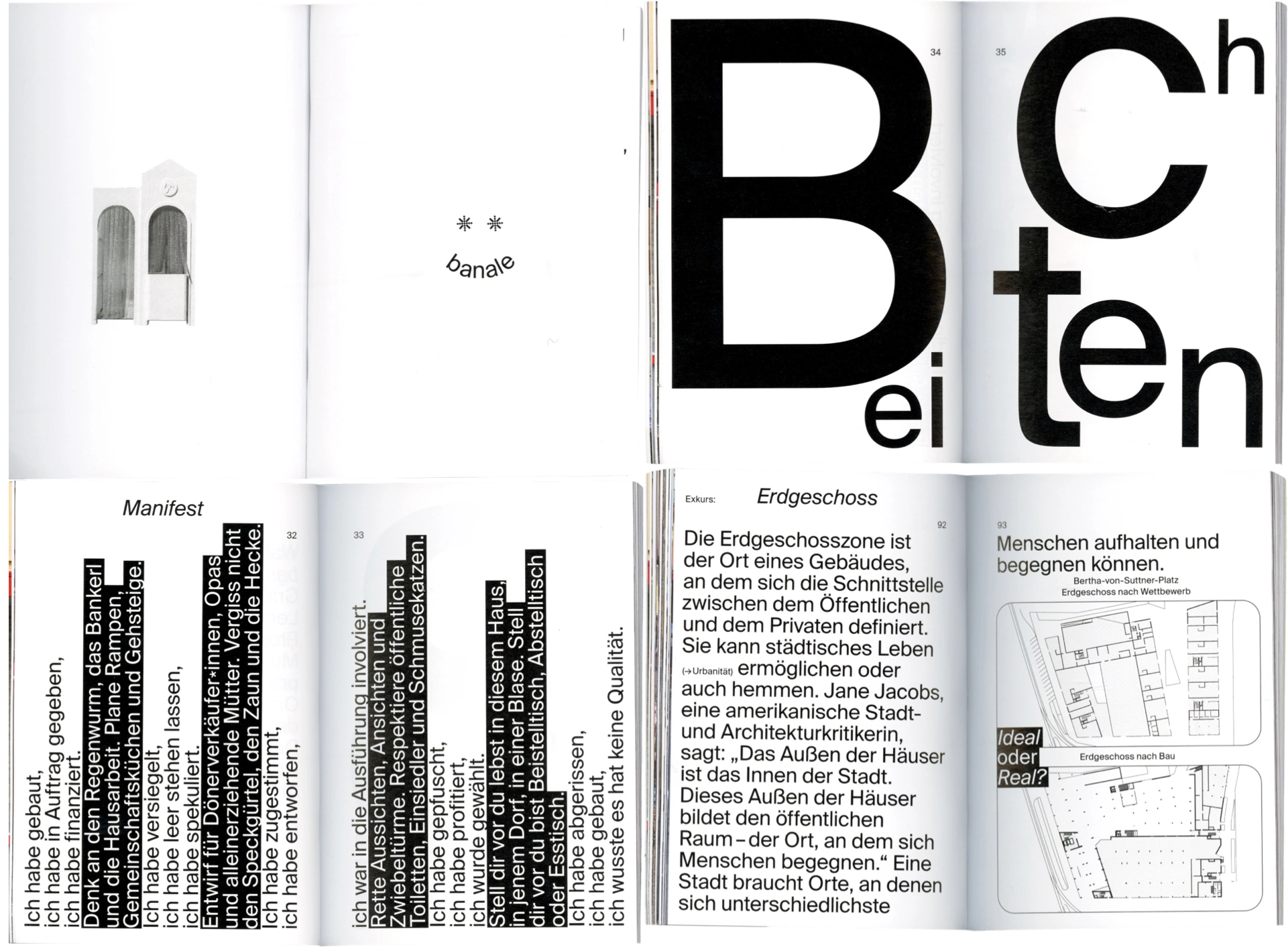
Editorial, motion and social media design for
Protocol 14, a magazine exploring non-conforming
architecture
Collaborators: J. M. Aymar, A. Kiefer, S. Messner
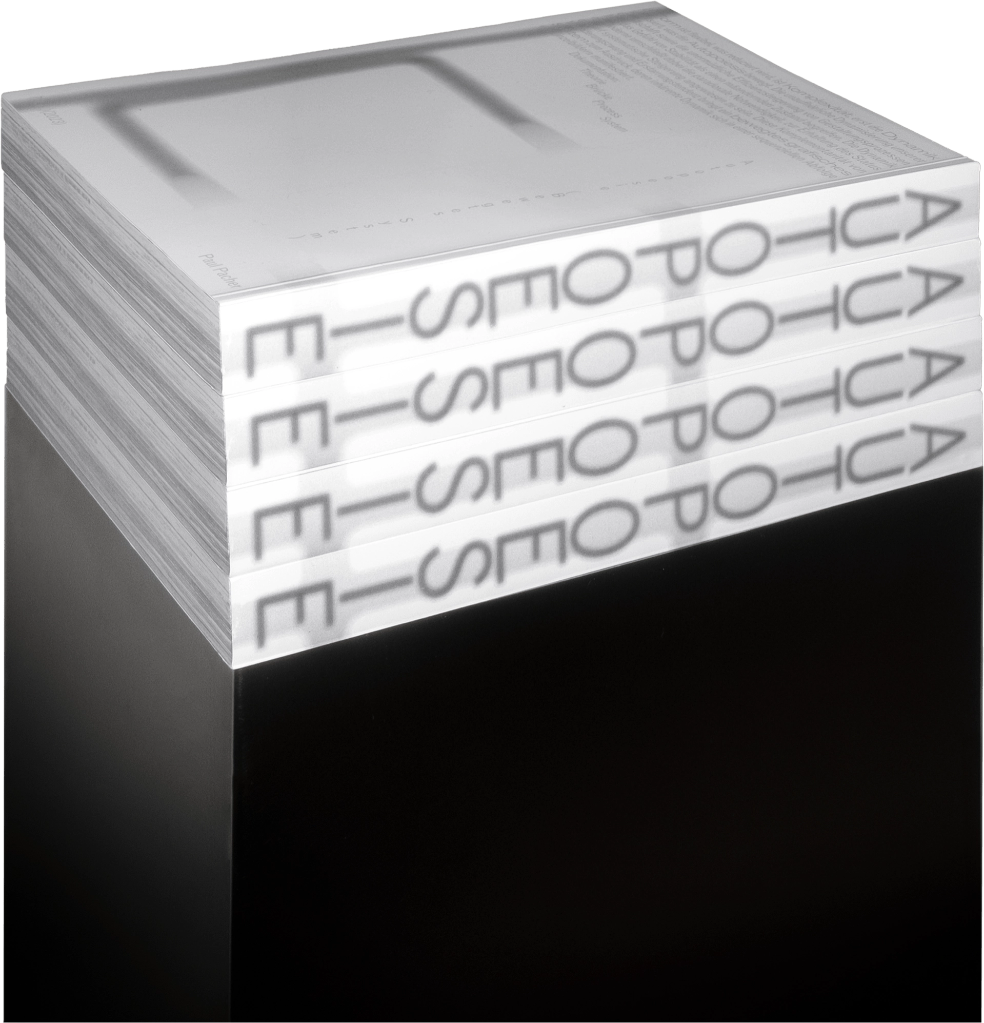
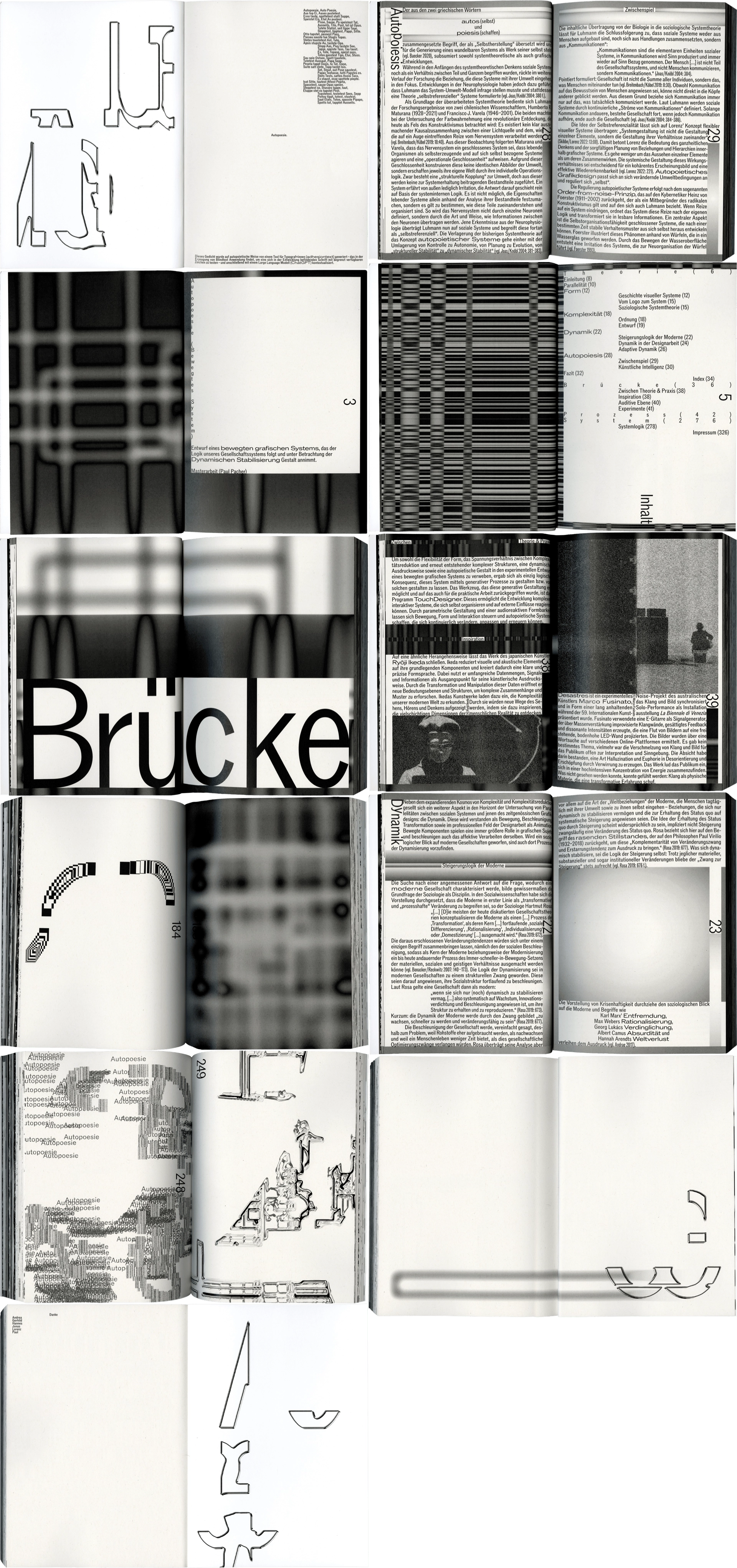
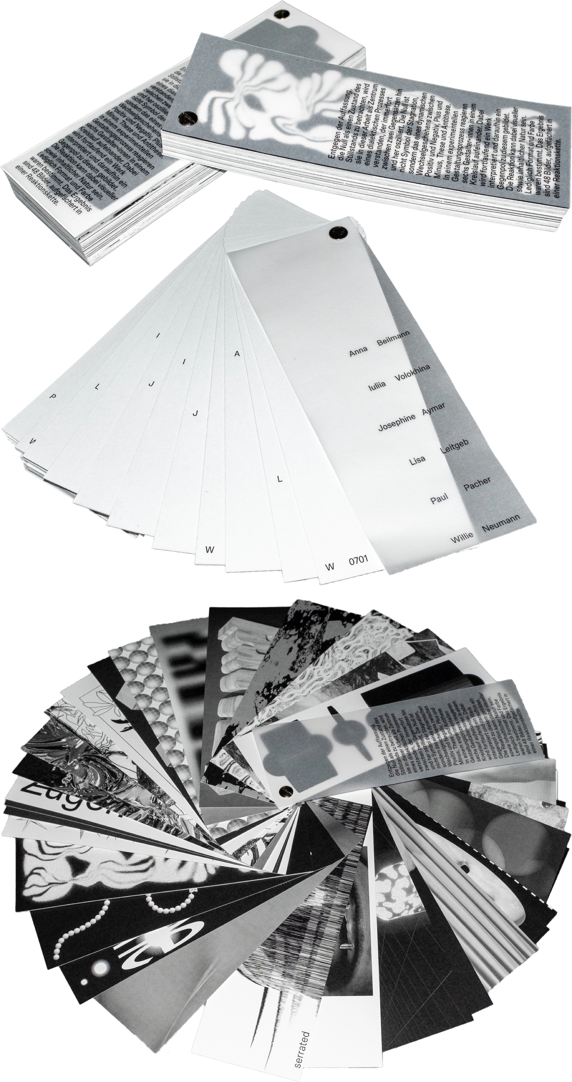
Concept, editorial, motion and generative design of
Autopoesie, exploring the tension of a sequential
visual system
Award: It’s a book
Branding, screen design and merchandise for LOOP

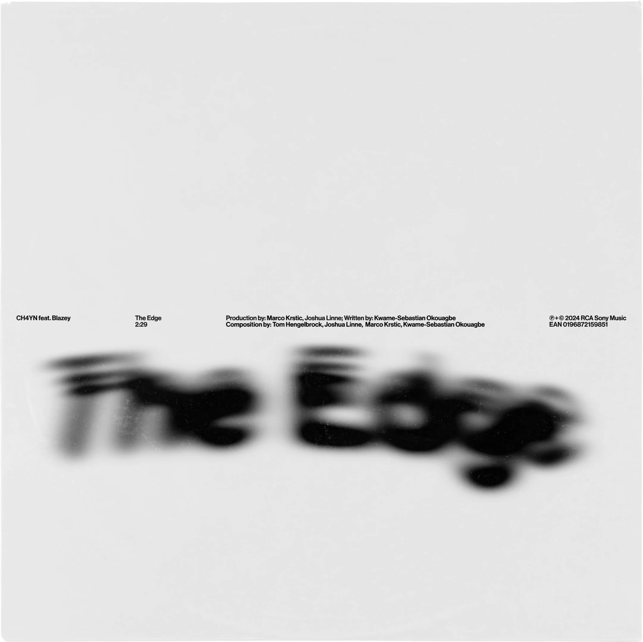
Visual identity and album artwork for CH4YN, a DJ and
producer
AD: Niclas Moos; DP: Matthias Leidinger


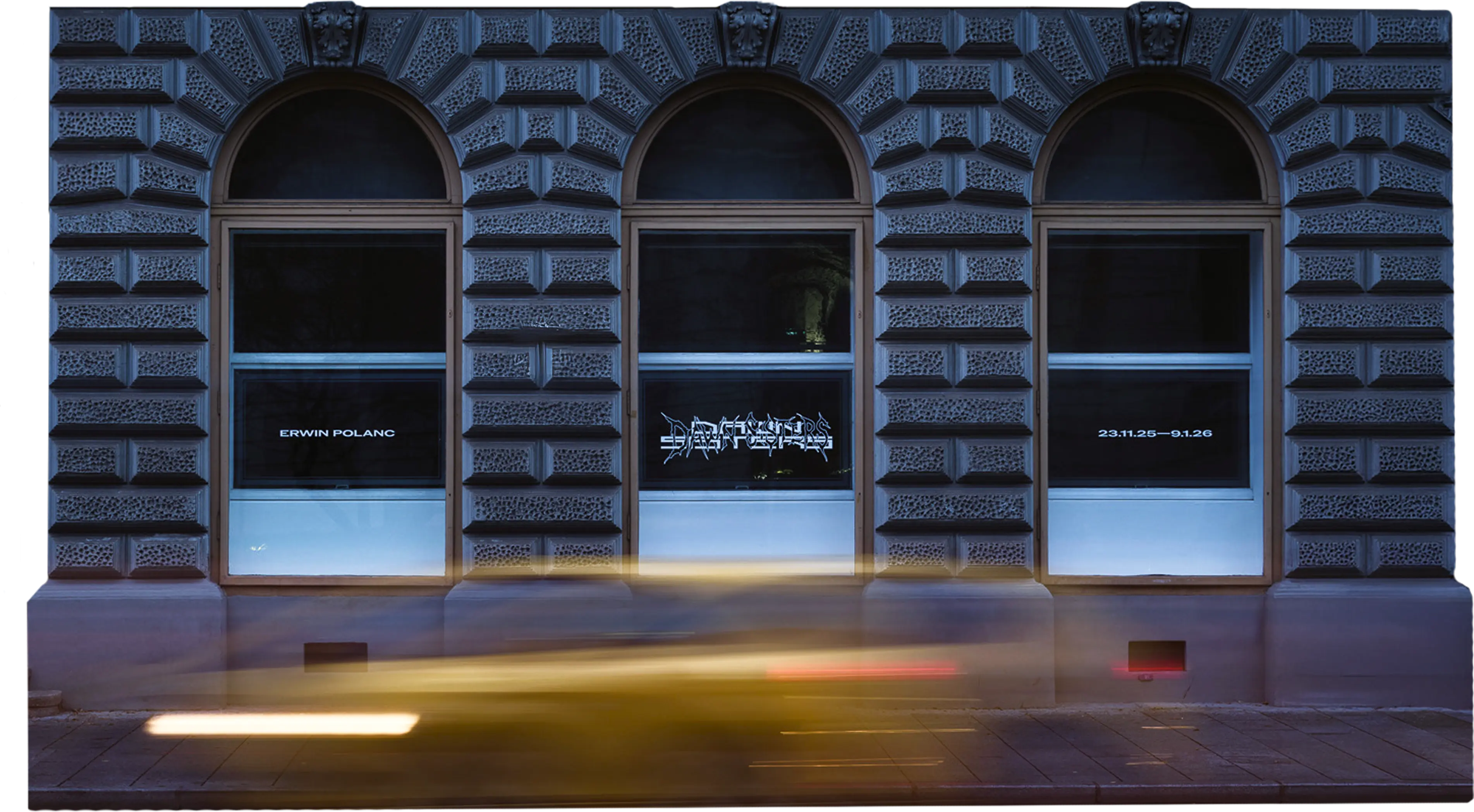
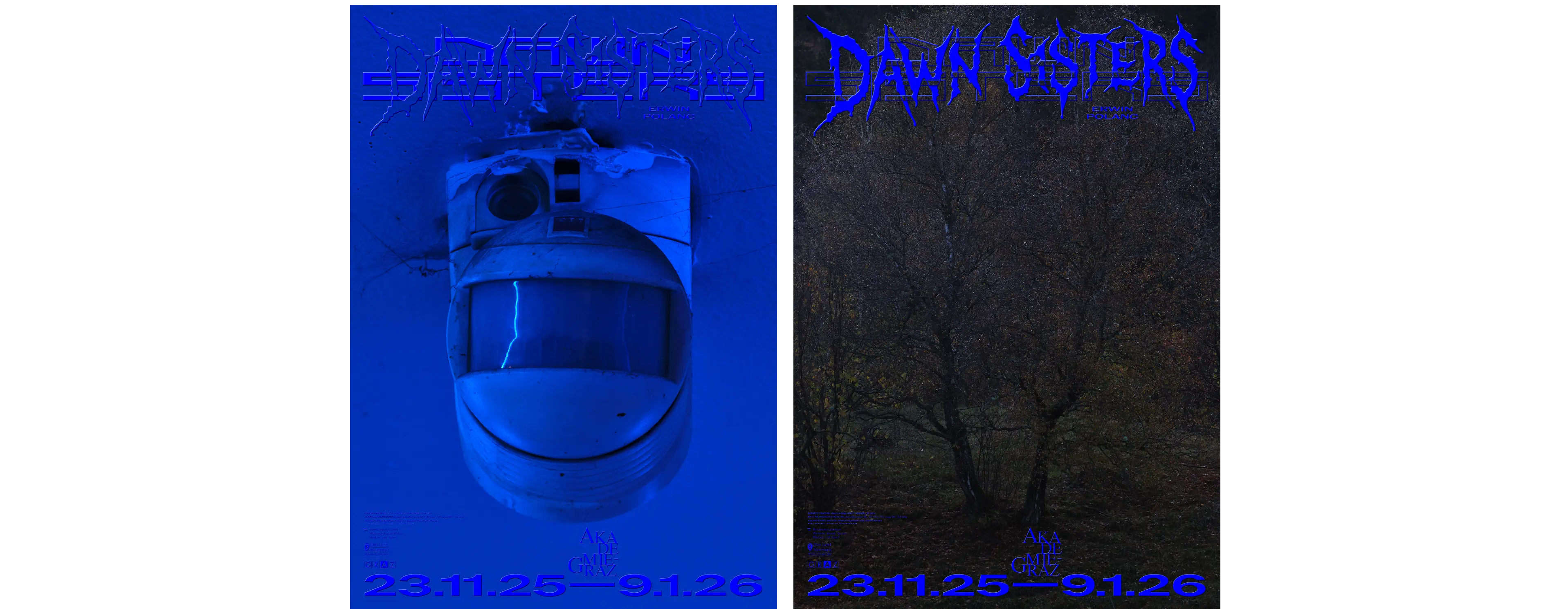
Exhibition identity, poster design and editorial design for
Dawn Sisters by
Erwin Polanc
at the
Akademie Graz
Visual identity of
V29, a socio-ecological collective building project
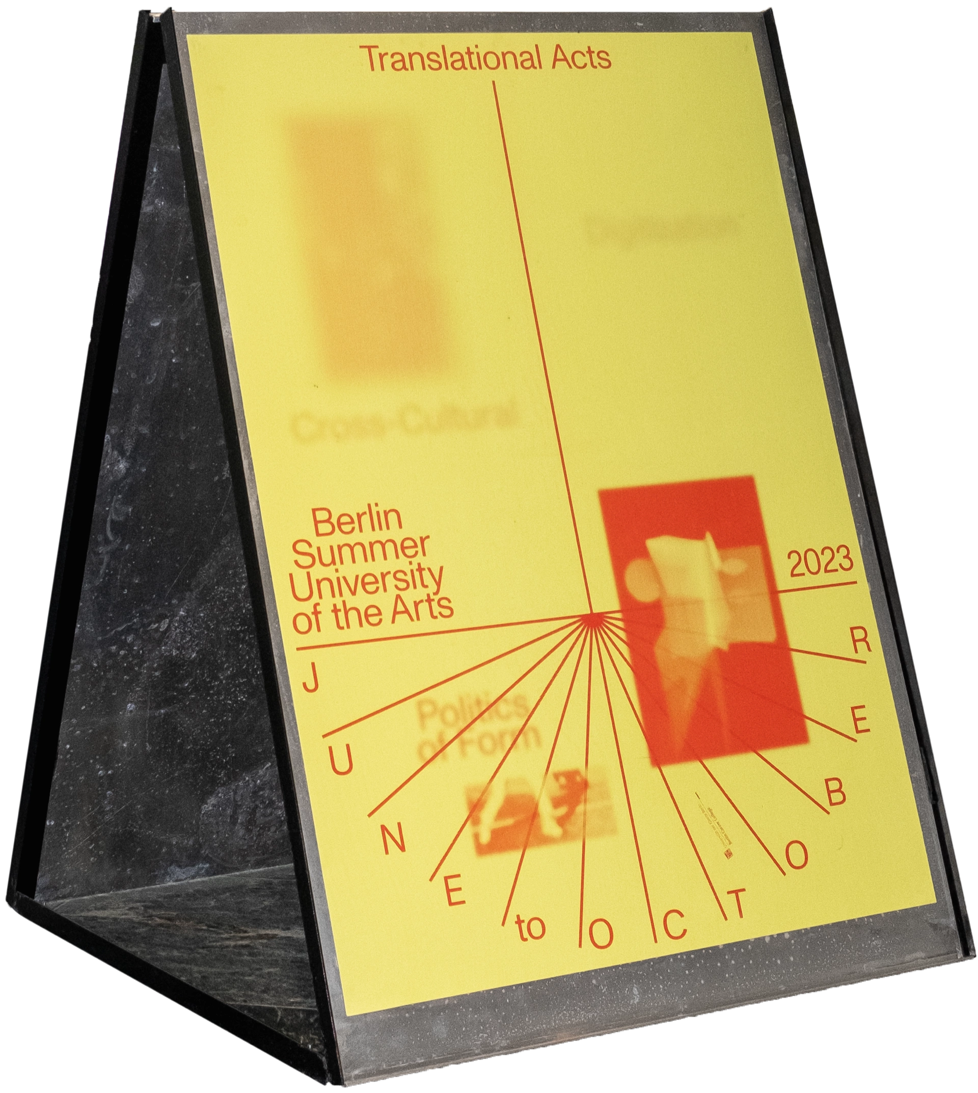
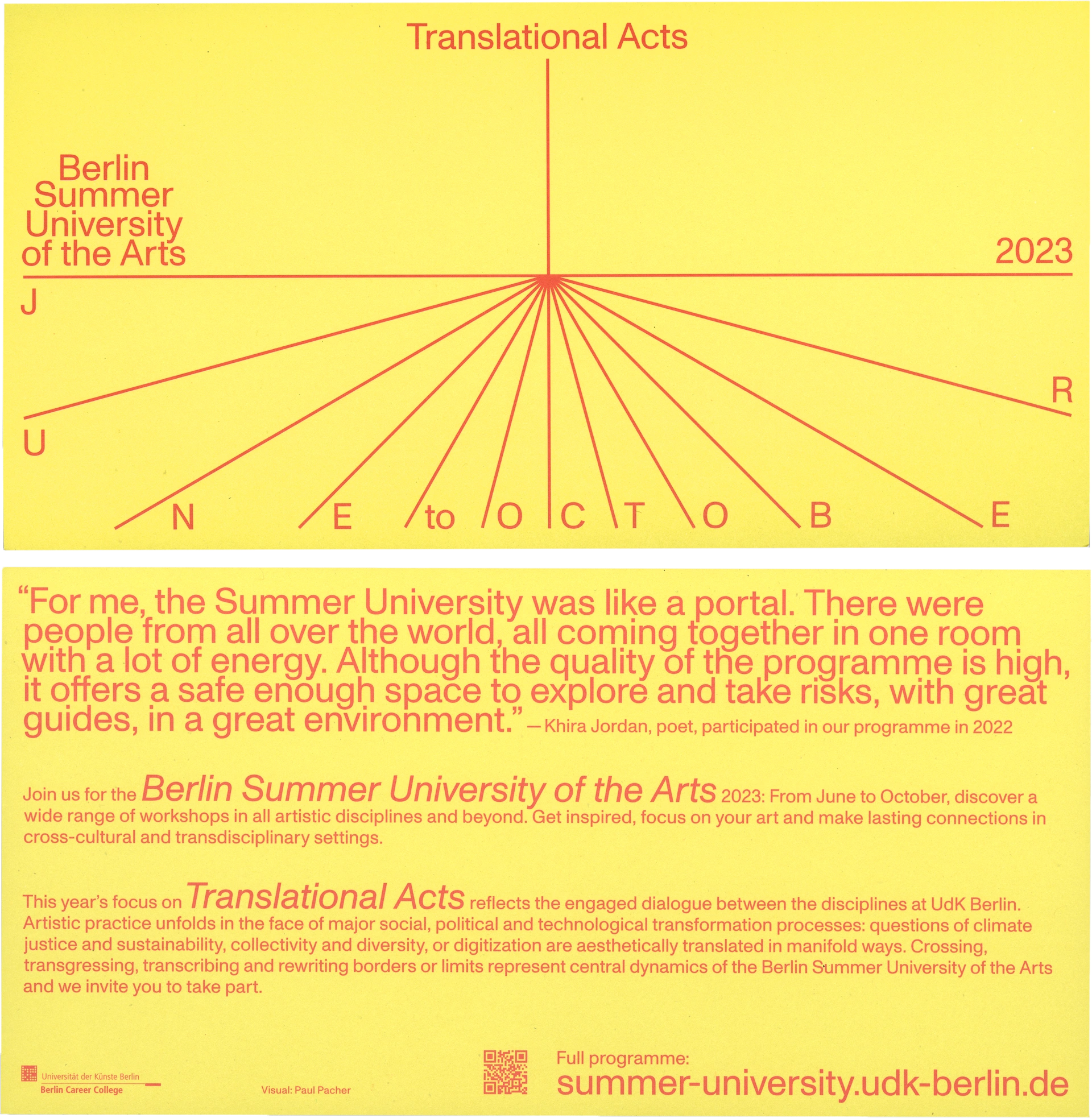
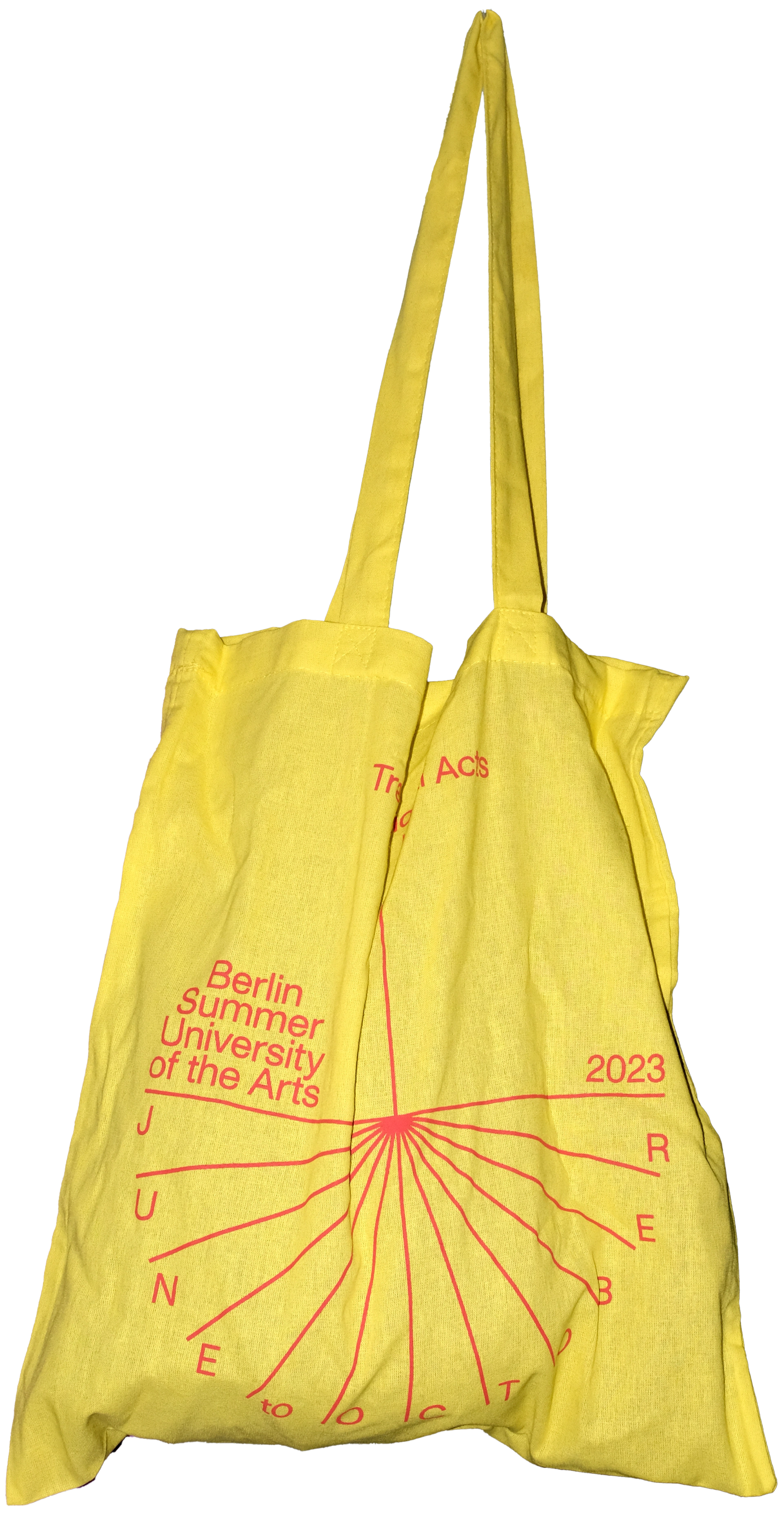
Visual identity and motion design for the
Berlin Summer University of the Arts
Award: 100 Best Posters D/A/CH
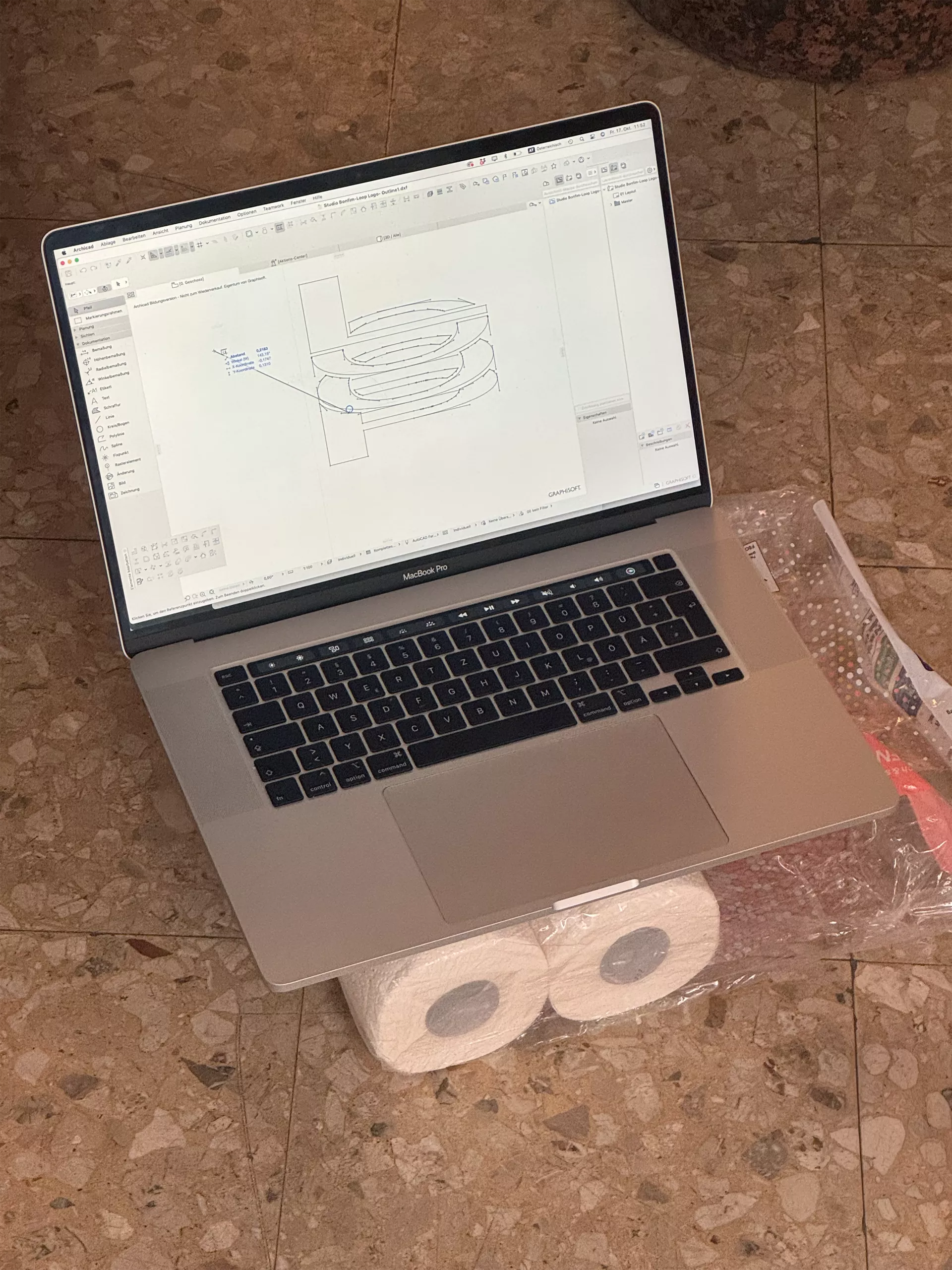
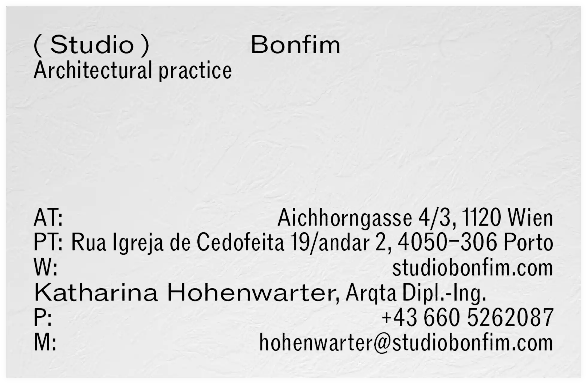
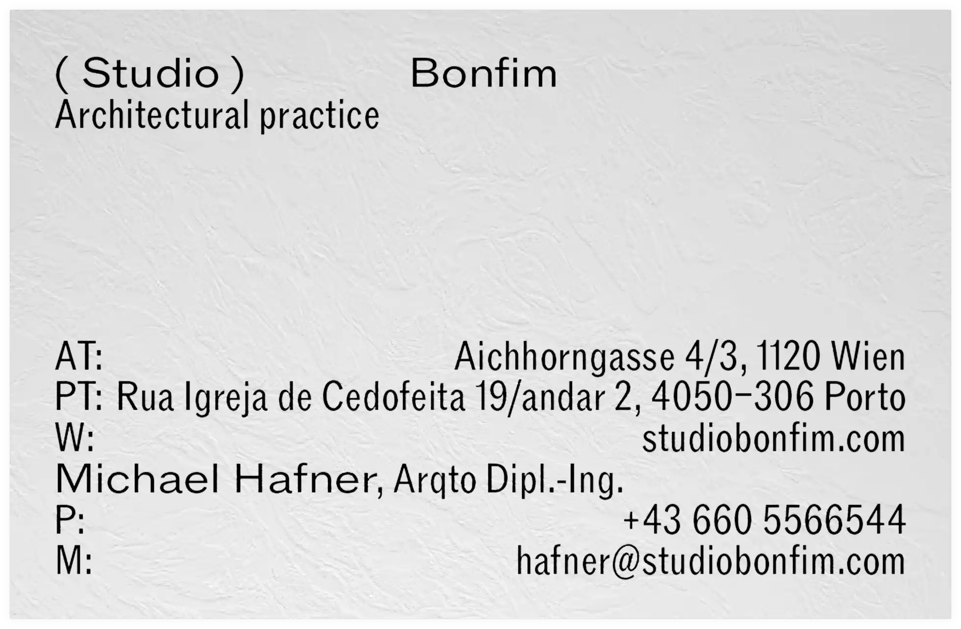
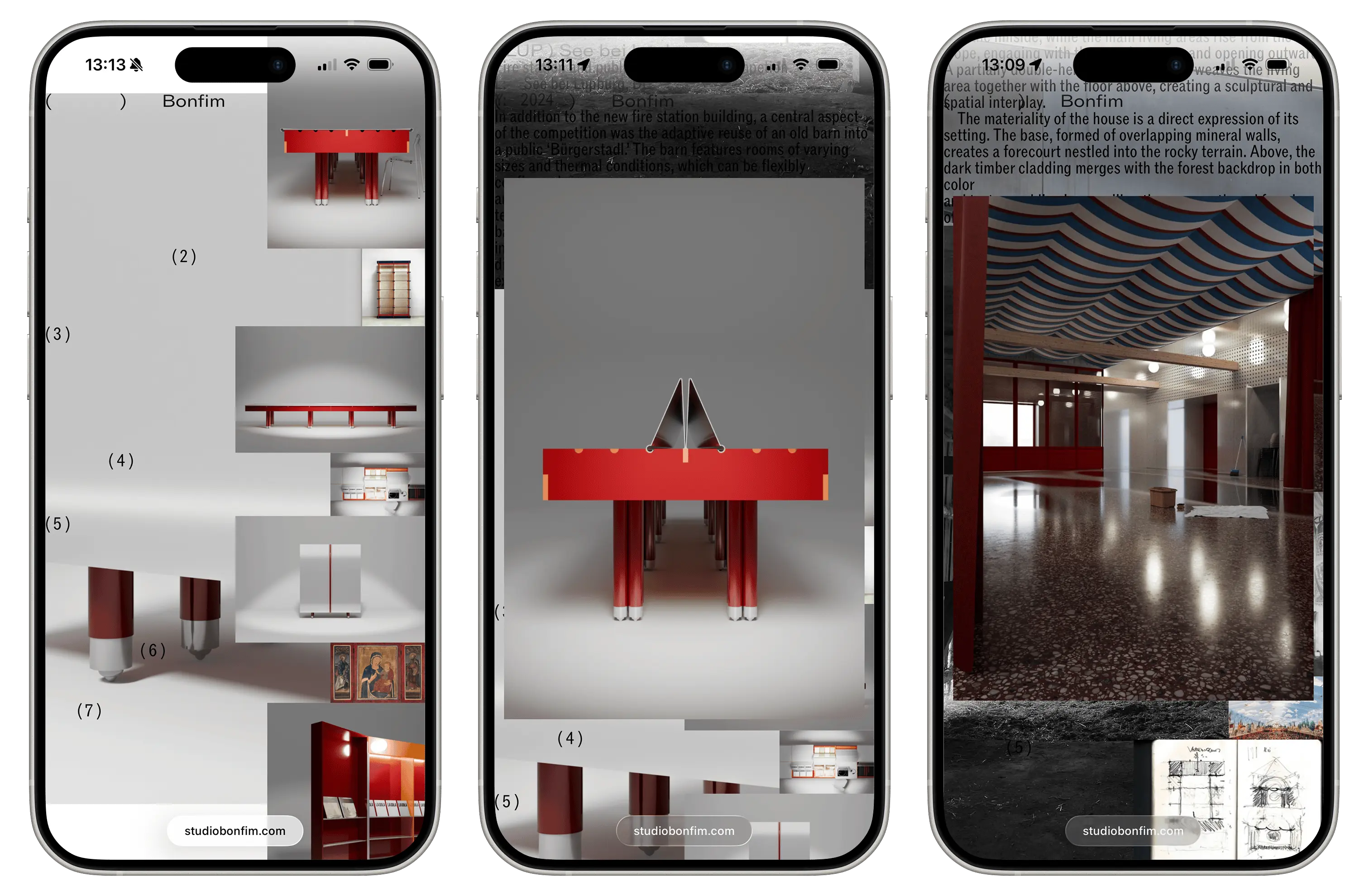
Branding for Studio Bonfim, an architectural and
design practice in Vienna and Porto
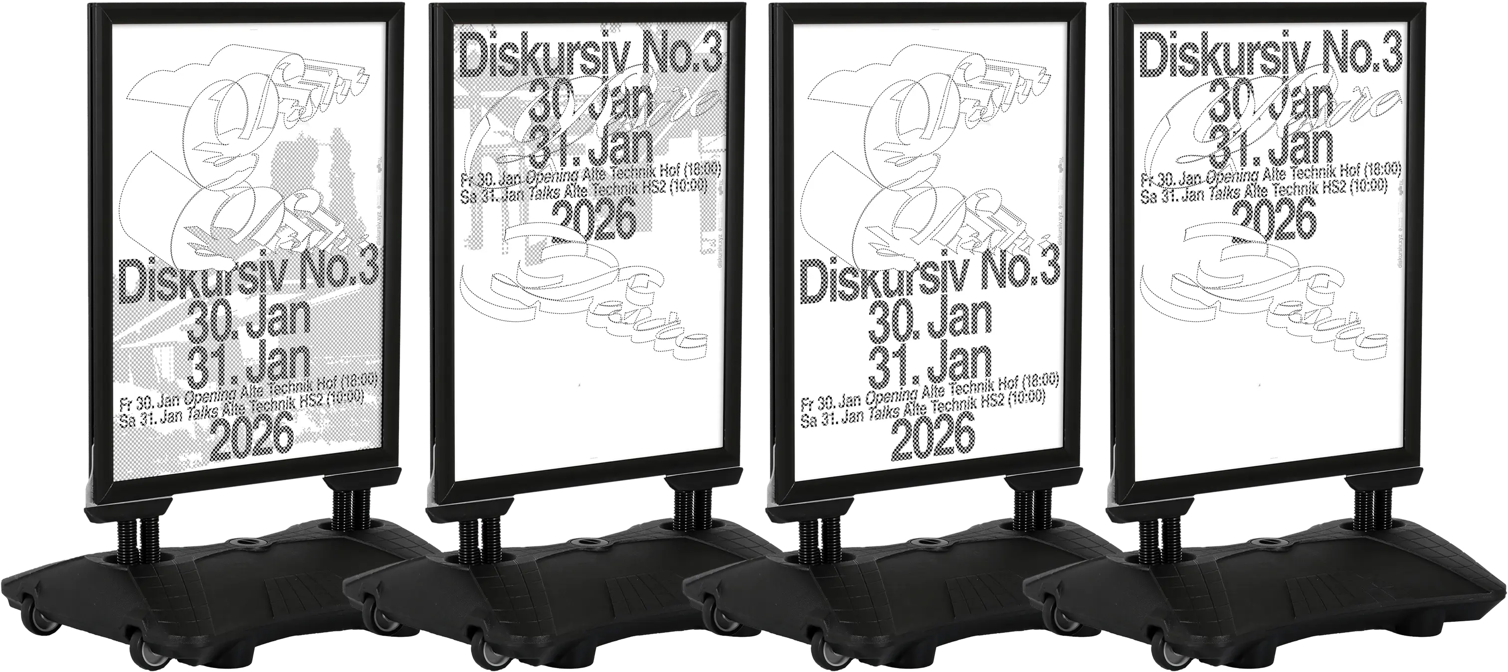
Visual identity for Diskursiv No. 3 »Desire«

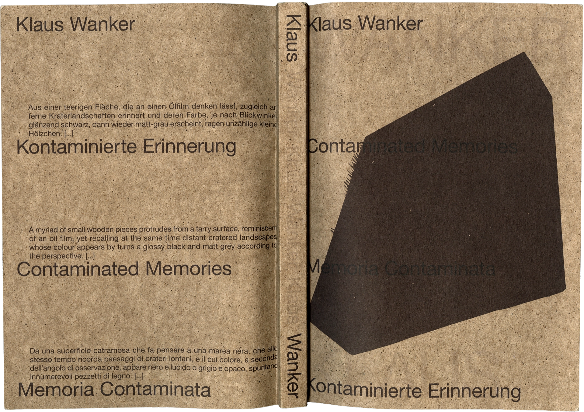
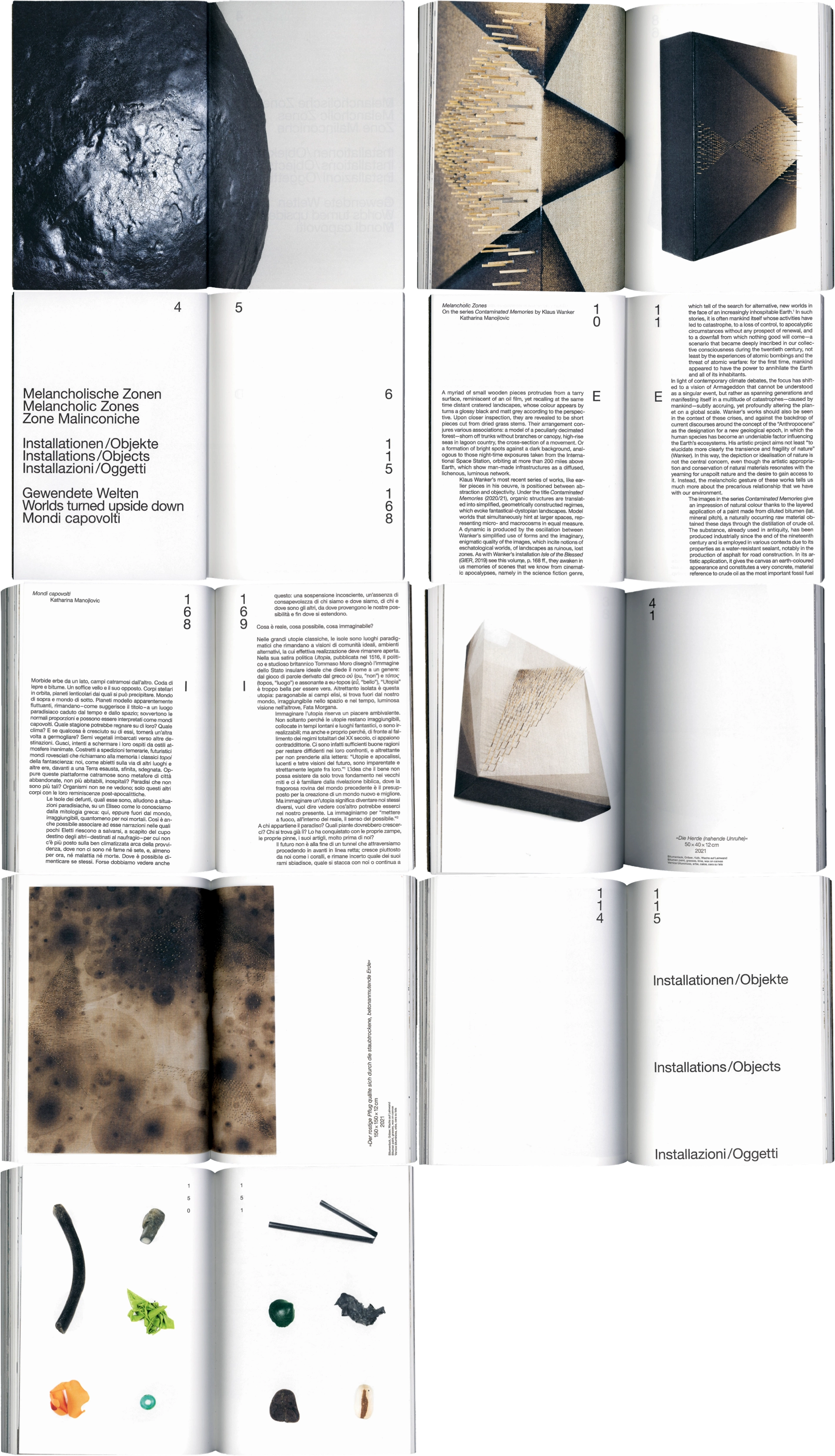
Editorial design for Klaus Wanker, a publication
documenting the artist’s work and material explorations
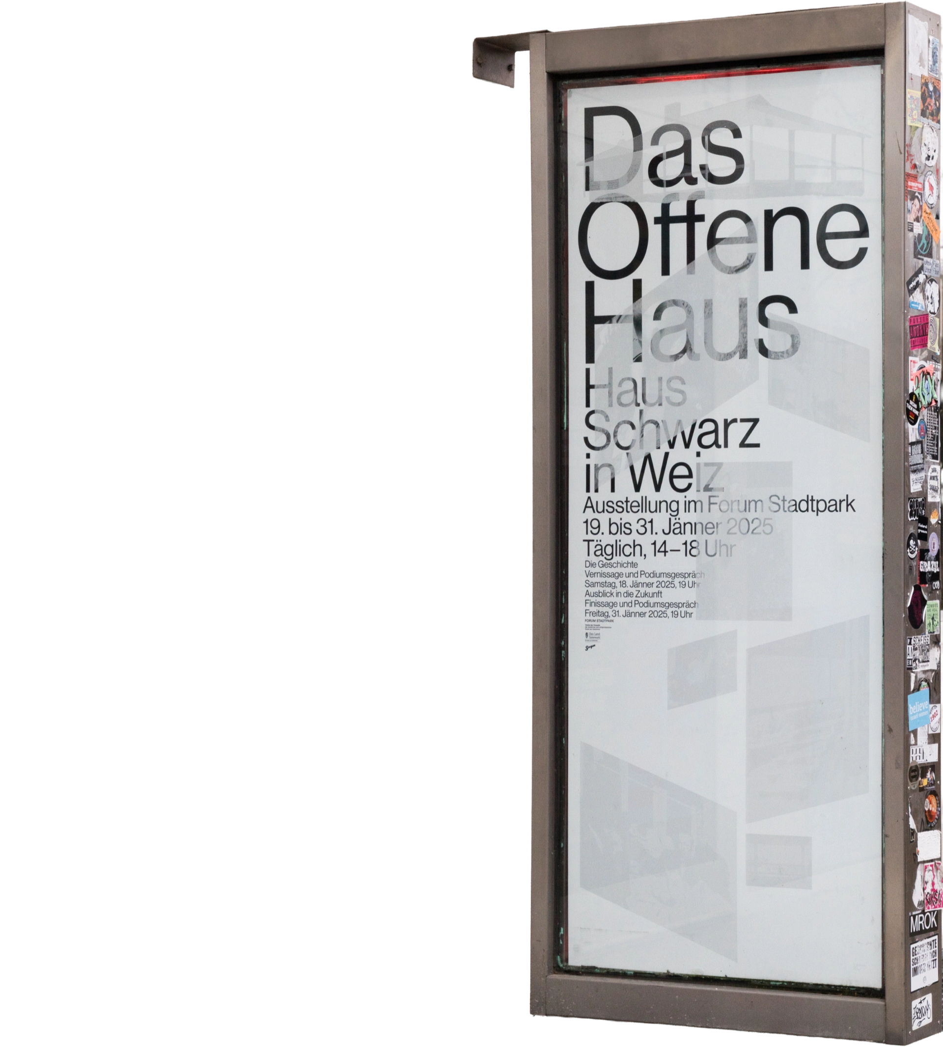
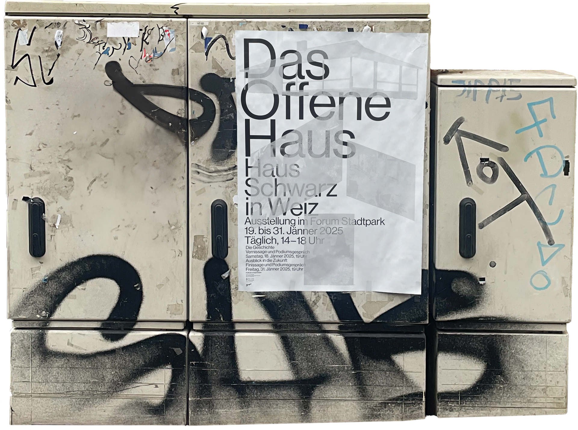
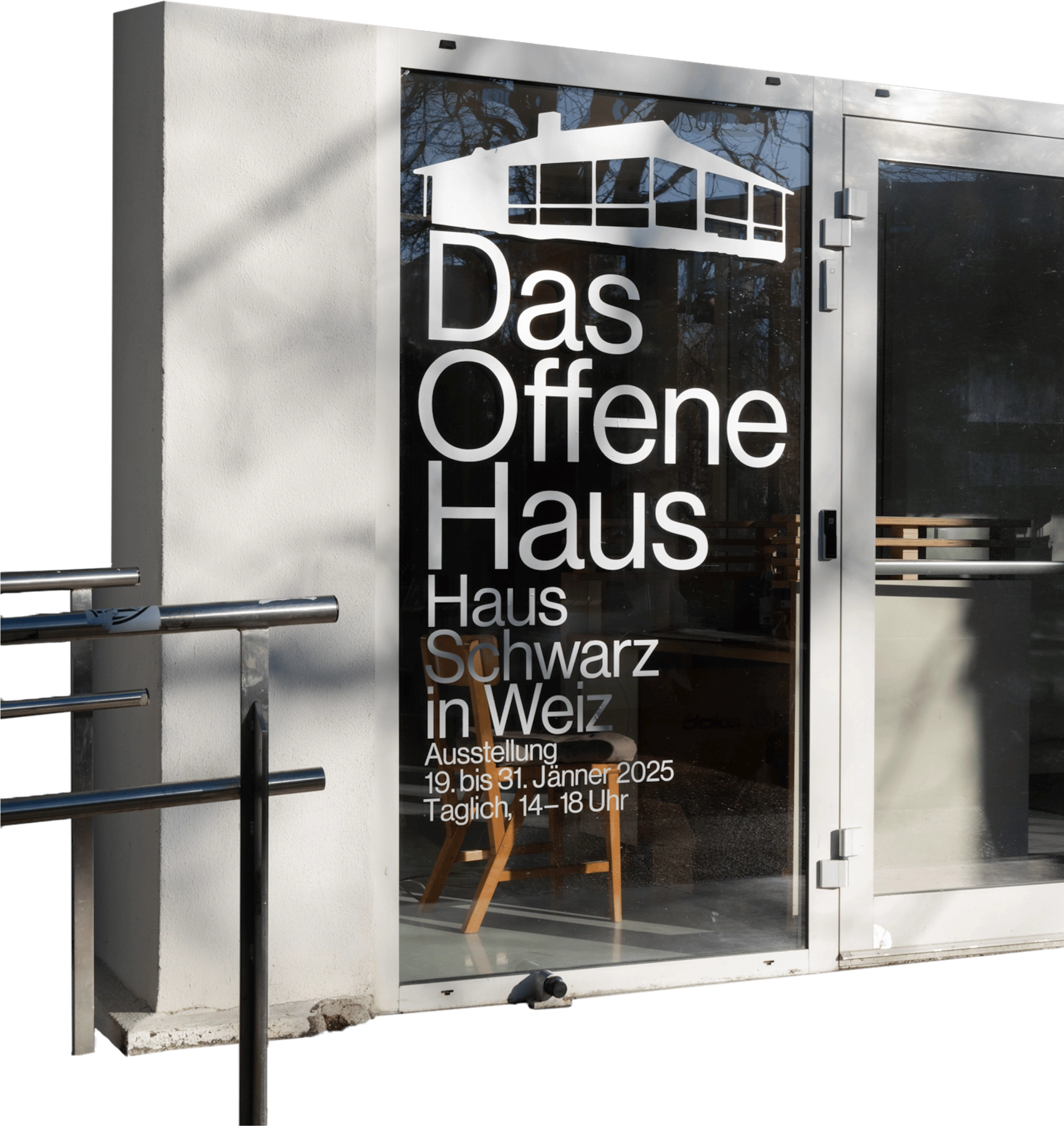
Exhibition identity for Das offene Haus of Hannes
Schwarz, a photography exhibition at
Forum Stadtpark
Scenography:
Elisa Wüntscher; Concept: Günther Koberg and Heidrun Primas
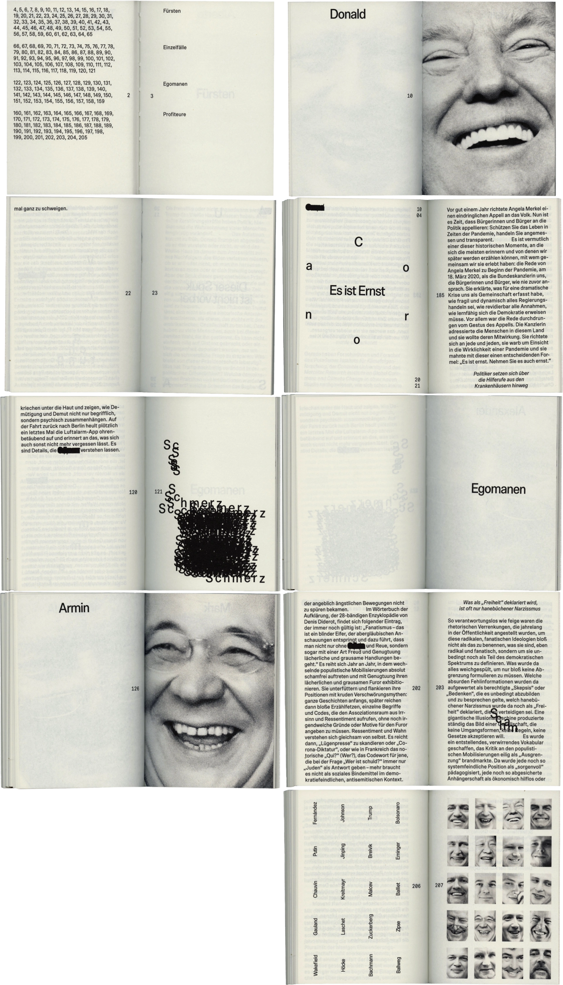
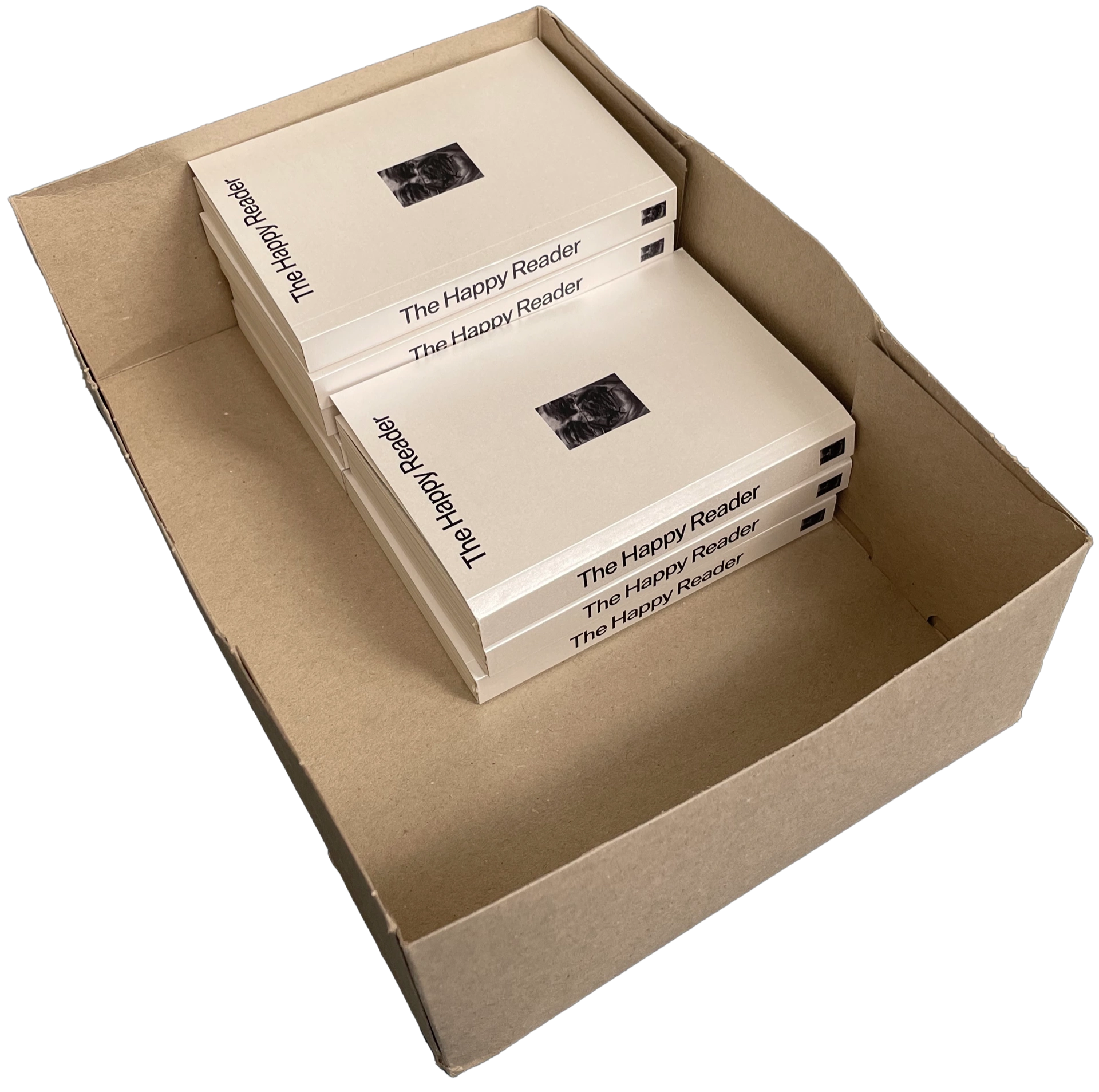
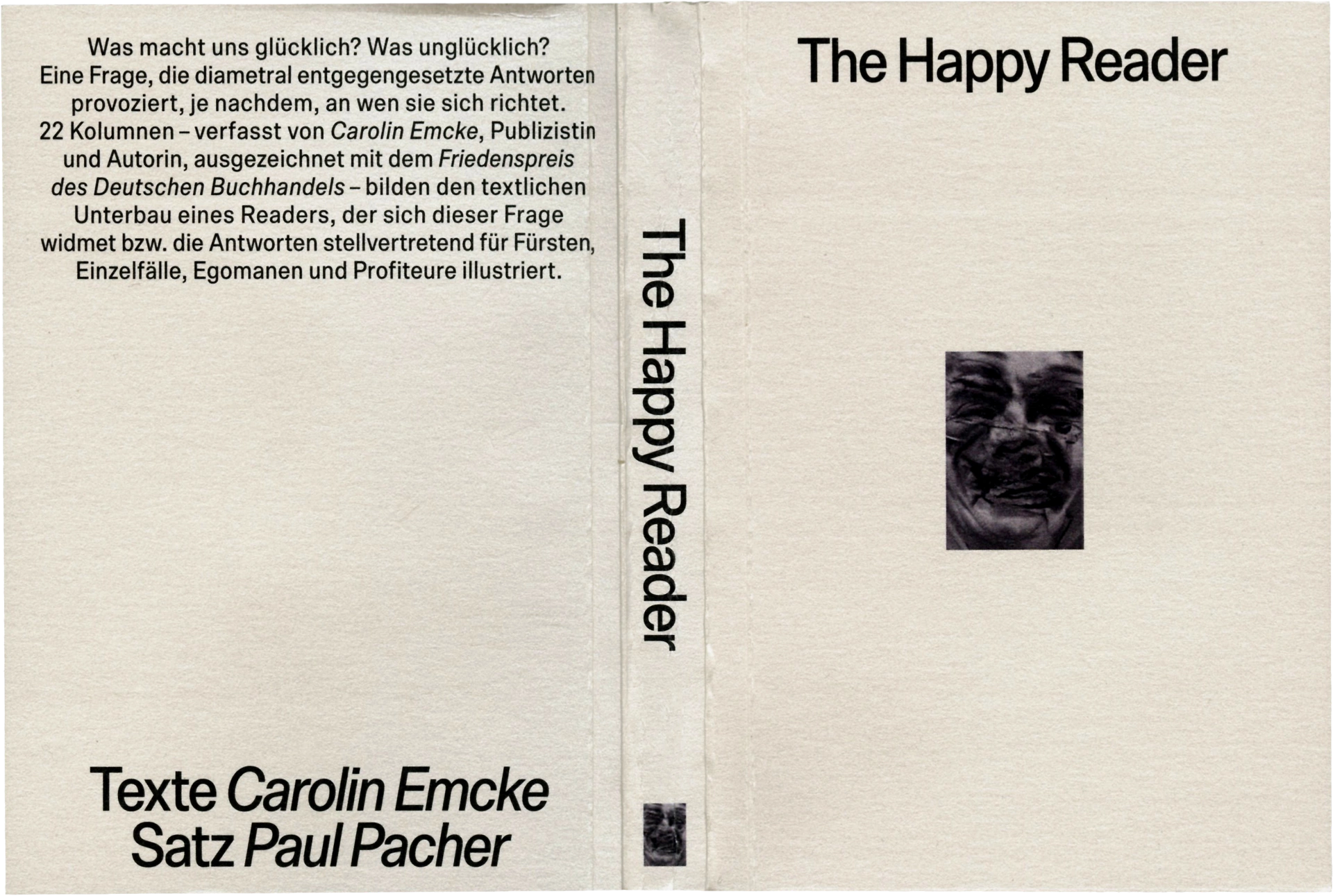
Publication design of The Happy Reader with 22
columns by Carolin Emcke
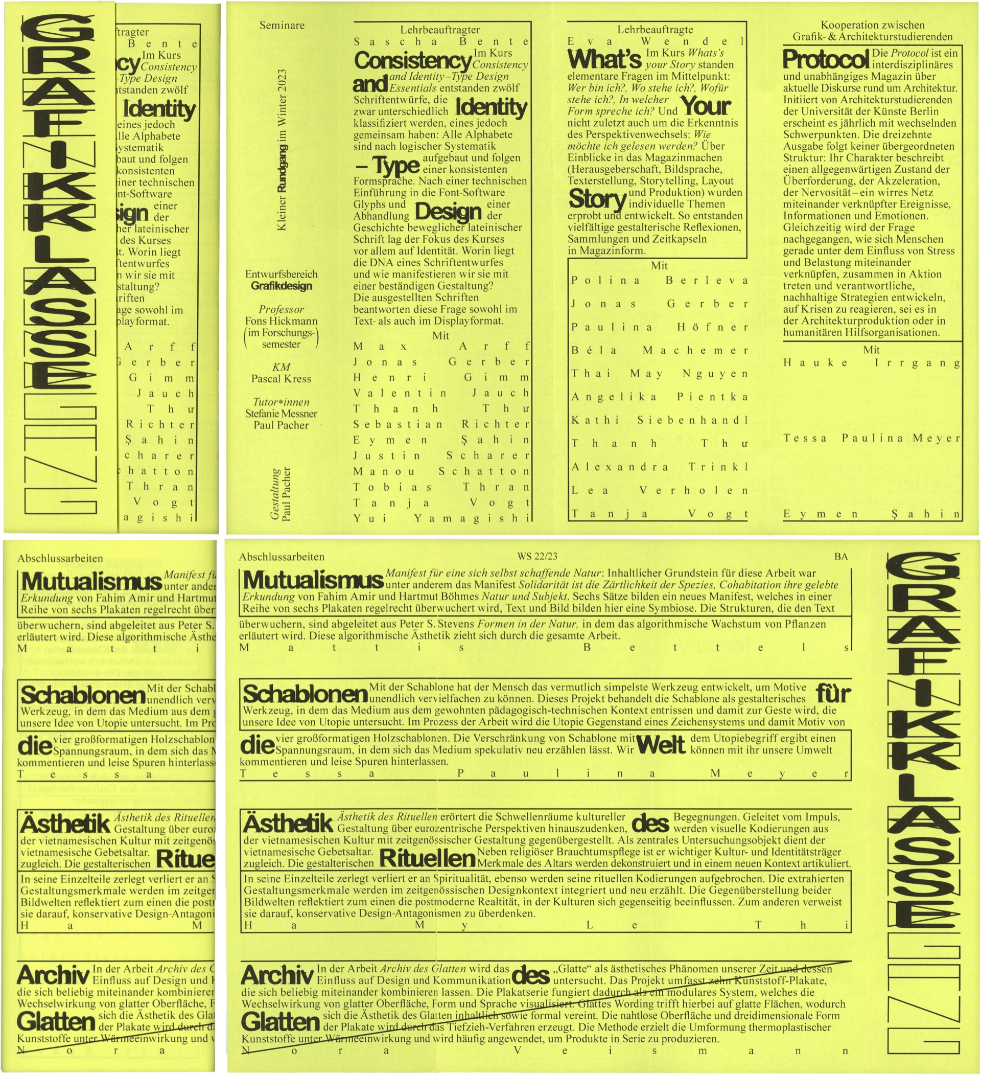
Exhibition identity for Grafikklasse at the University of the Arts Berlin
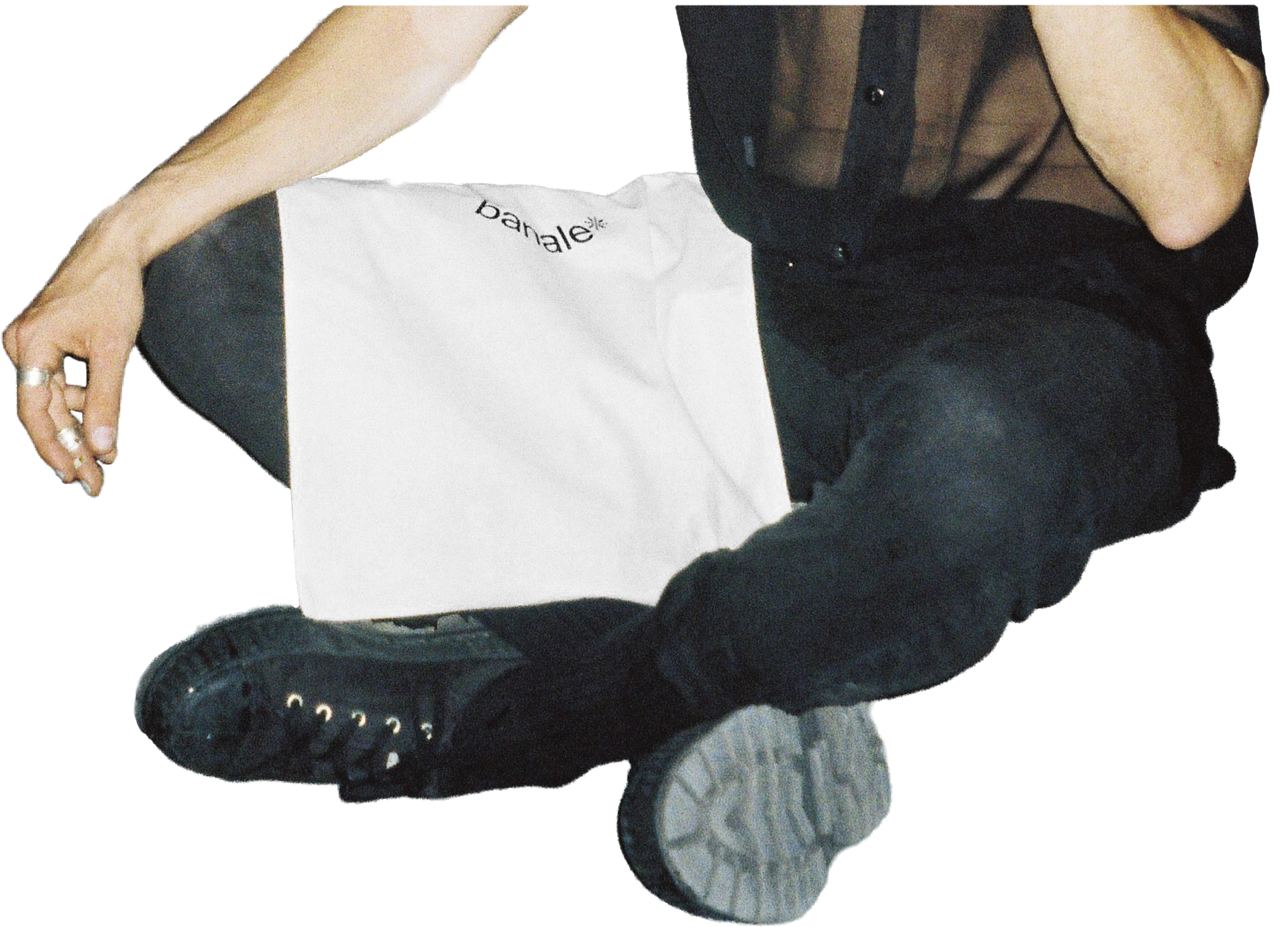
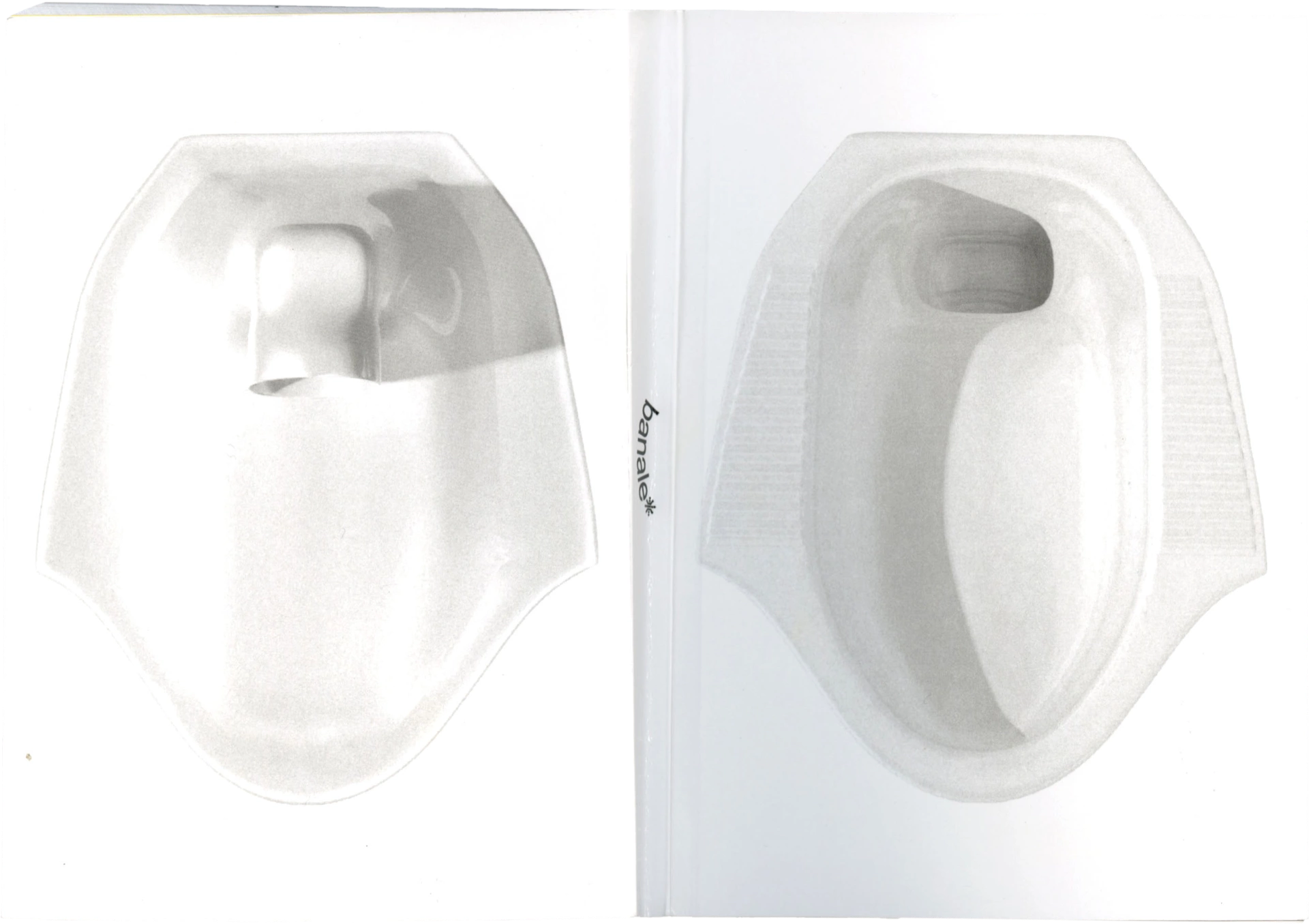
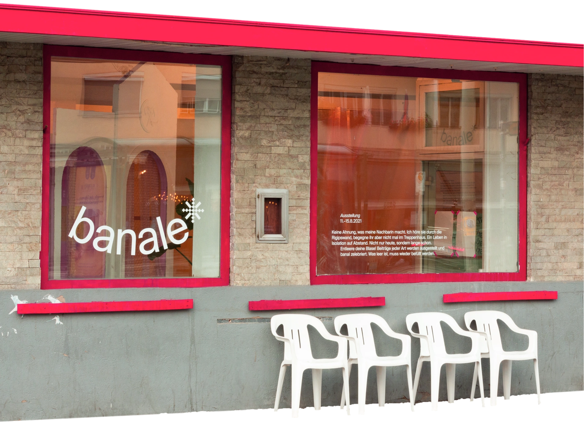
Exhibition and editorial design for banale, an
interdisciplinary exhibition series


Postcard for Happy New Year for the University of the Arts Berlin
Publication design for Rauch & Seifenblase
Collaborators: J. M. Aymar, A. Beilmann, L. Leitgeb, W. Neumann, I.
Volokhina
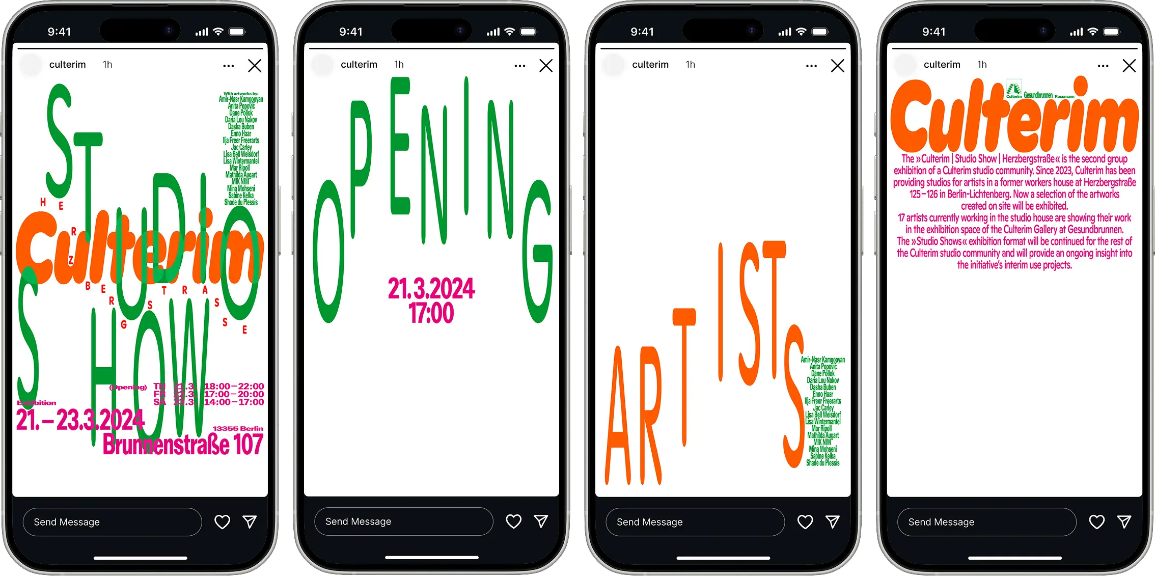
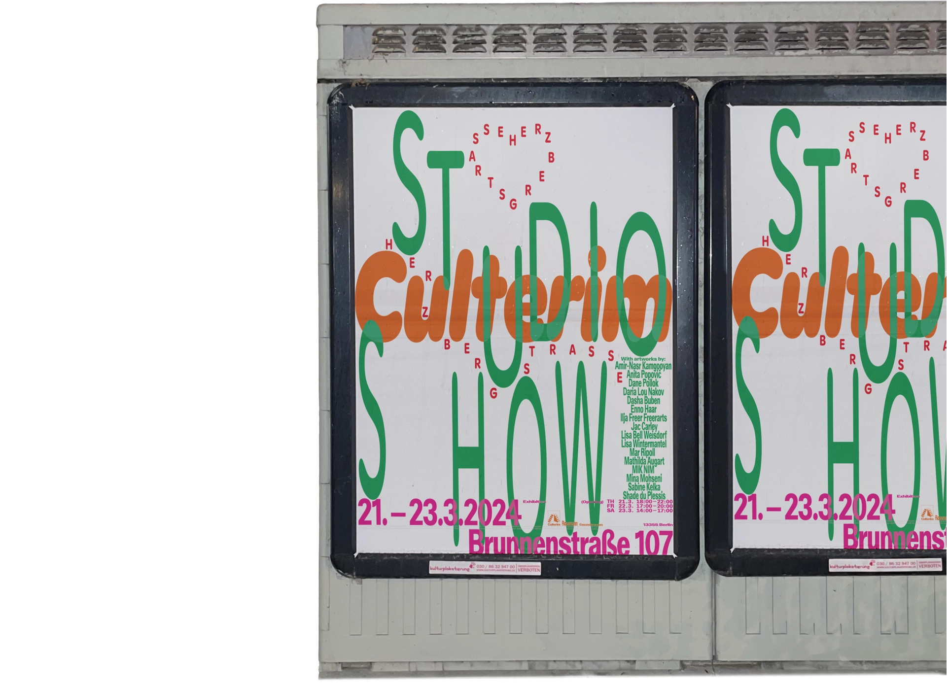
Poster and social media design for
Culterim Studio Show
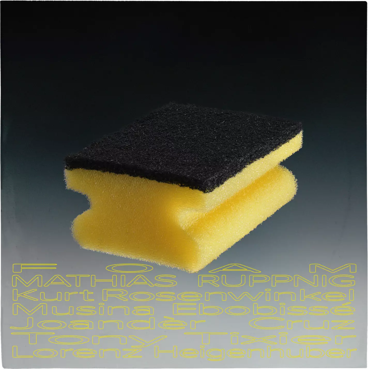
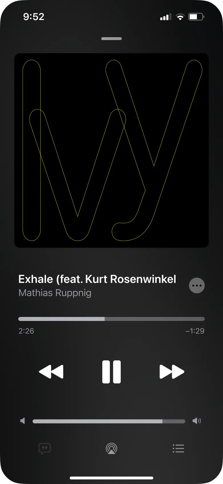
Album artwork of FOAM for Mathias Ruppnig with Kurt
Rosenwinkel and others
PD: Manuel Schaffernack


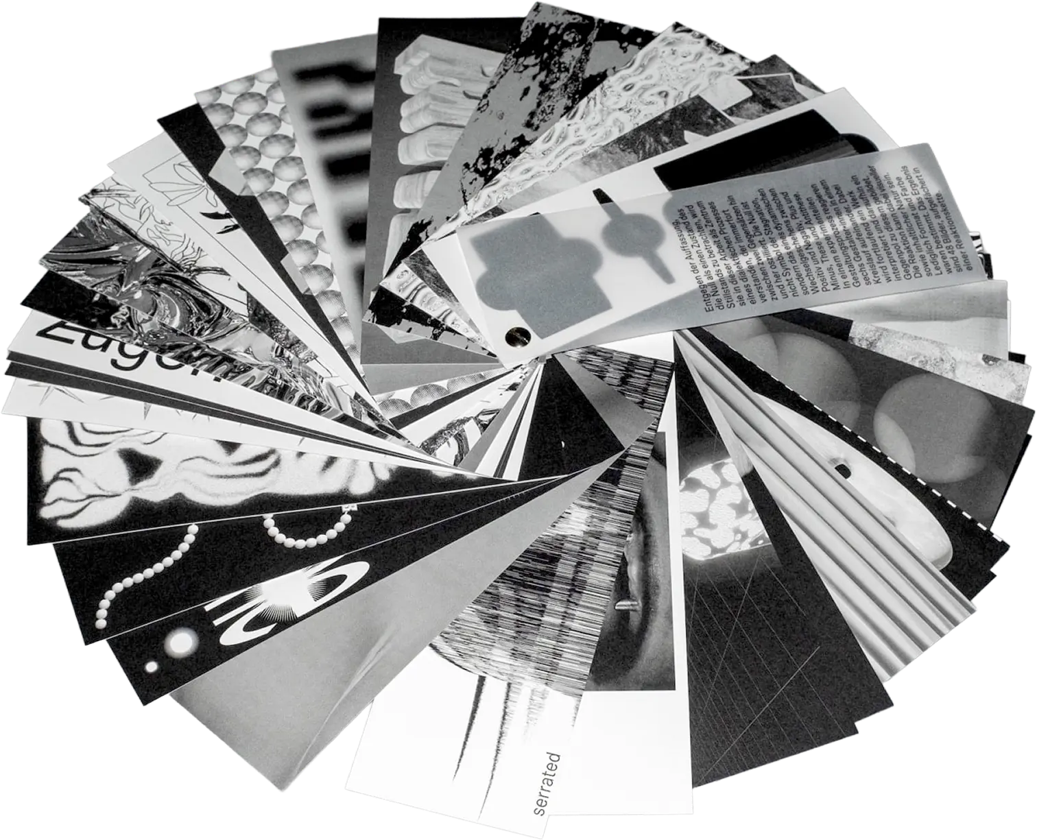
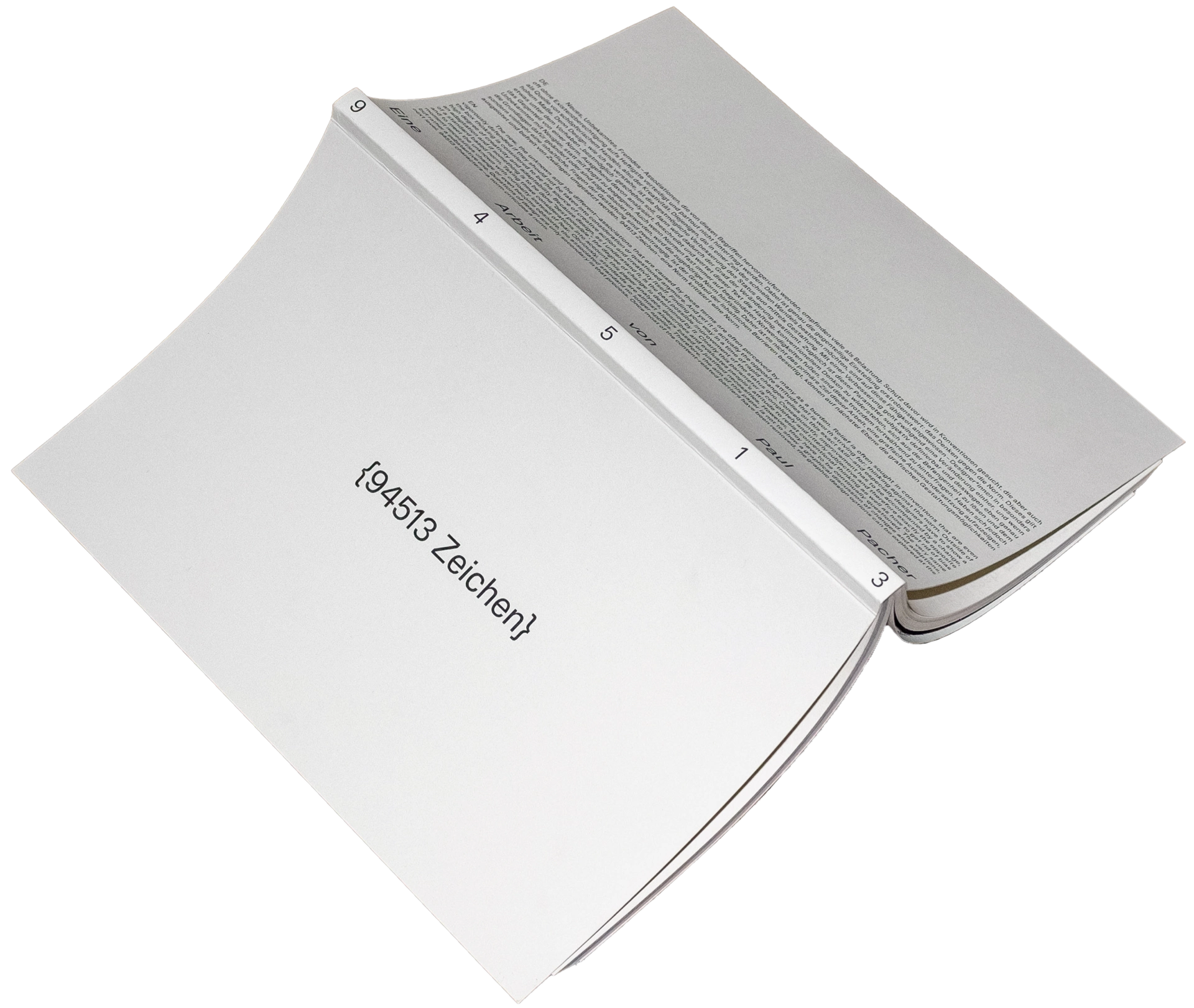
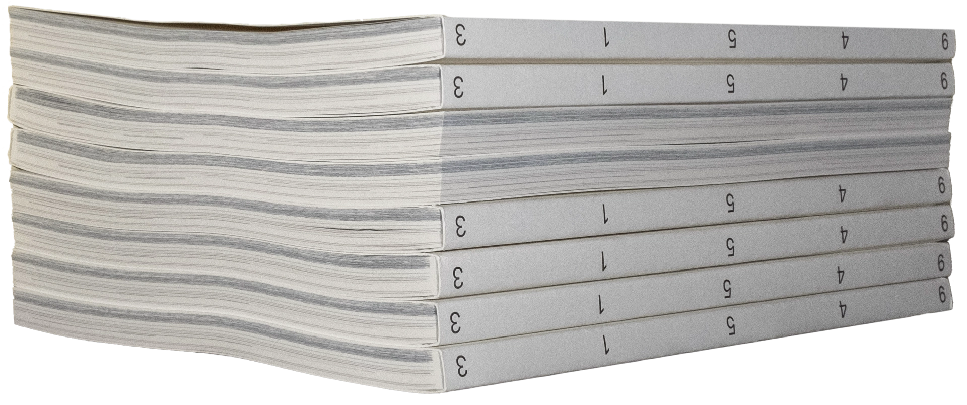
Concept and publication design for 94513 Characters
Award: Red Dot
Titles and poster for Made Memory an essay film by
Vincent Carter

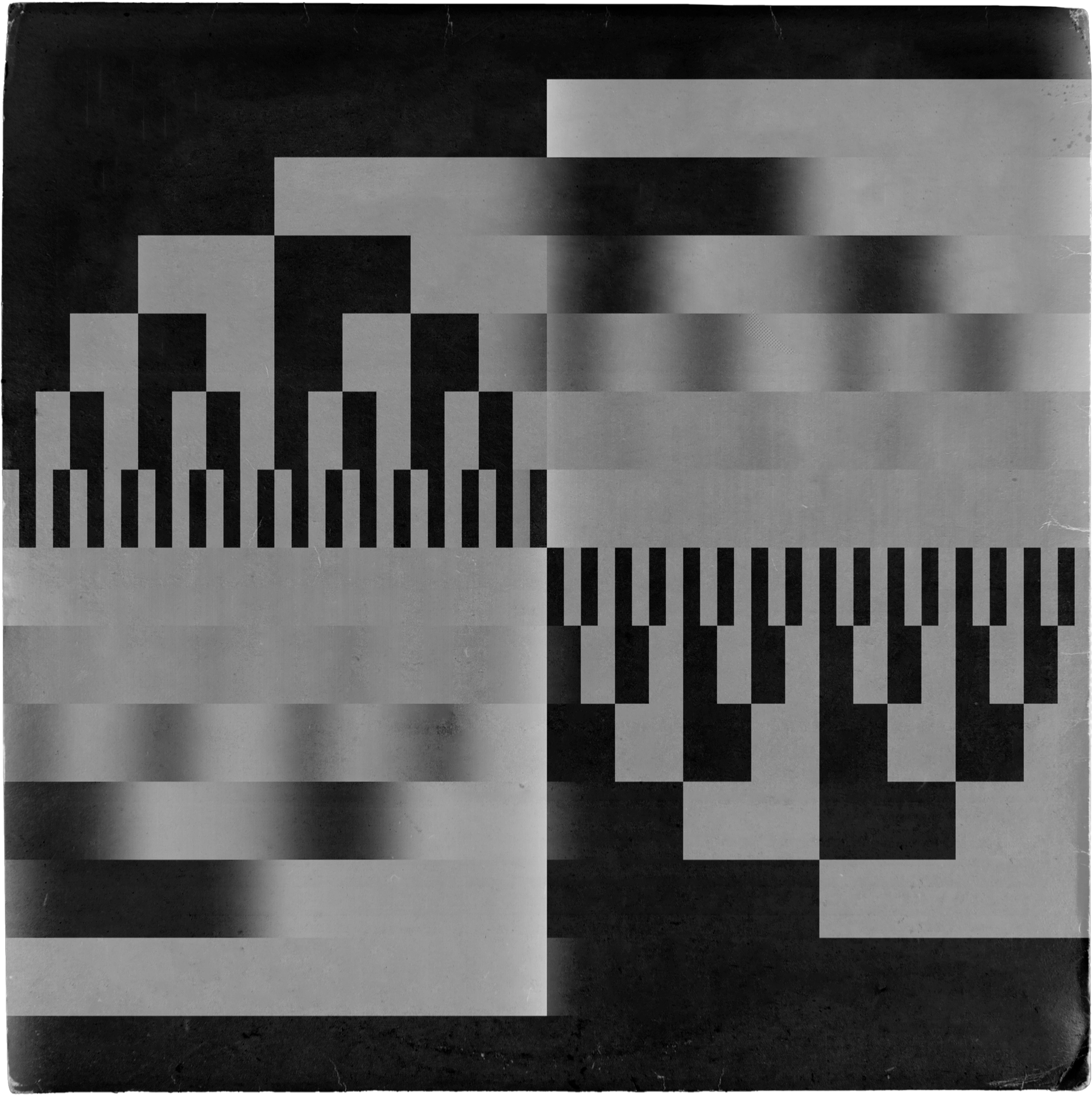
Album artwork for Endym, created for the 25/41 online
music gallery
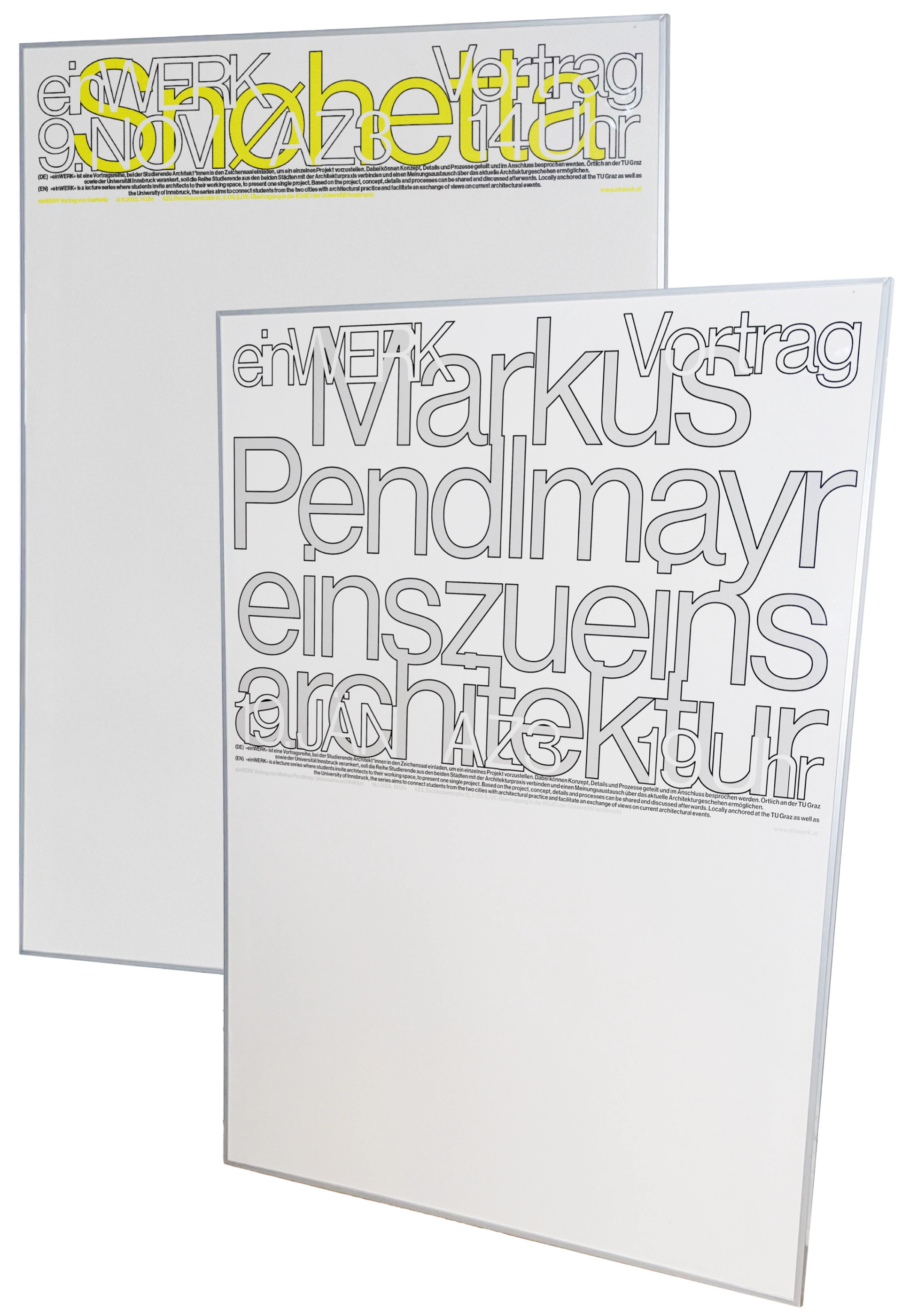
Poster and screen design for Einwerk, a lecture
series at TU Graz and the University of Innsbruck